As I continue to analyze the crime data for Denver, I have been looking at useful ways to visualize the data. Socrata is a great platform that is focused on delivering this data to the consumer.
There are a few websites that utilize the same crime data where you can see individual crimes pinpointed, or summary statistics benchmarked against national data.
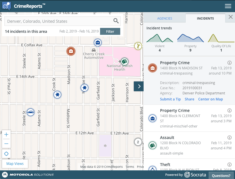
Location-specific crime data, good drill down and comparisons:
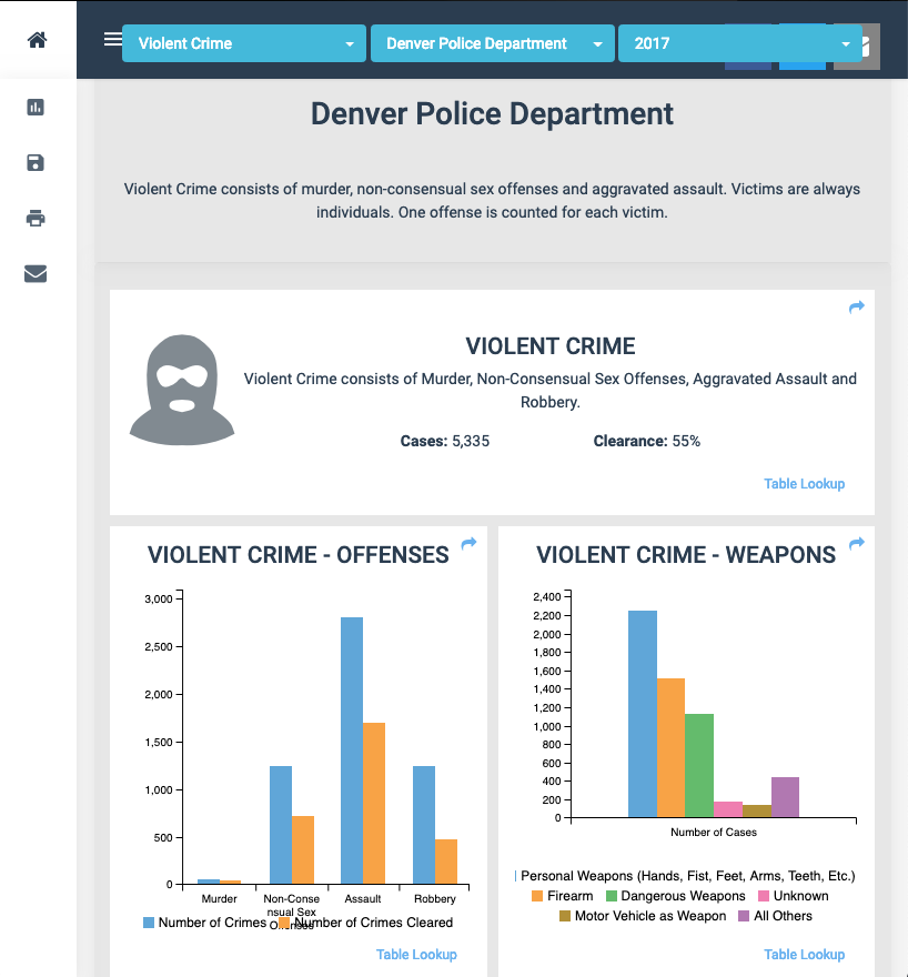
Zip code based, benchmarked against national crime rates:

Neighborhood-based, details behind a paywall:

Lots of visuals, sorted by crime type, yearly:
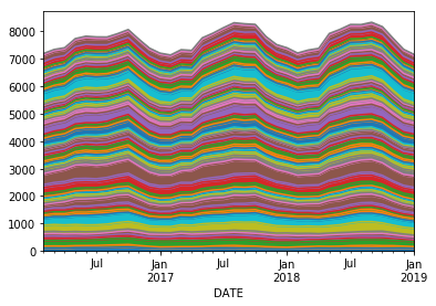
Average monthly crime by neighborhood
My previous chart of daily crime was too granular for most uses, so I charted a rolling mean [window=3] of the monthly crime by neighborhood. While it may be an obvious outcome, the chart says that crime is higher in the summer. Eg, cold weather is a larger deterrent of crime than the police.
Daily crime by neighborhood [Box Plot]
Leveraging the Plotly library again, I created a box blot of the daily crime for the five years of data made available.
max_index = list(df_neighborhood_month.max().sort_values(ascending=False).index)

trace_names = list(max_index)
traces = []
for trace in trace_names:
    traces.append(go.Box(y=df_neighborhood[trace].values, name=trace))

data = traces
py.iplot(data)
Monthly crime by neighborhood [Box Plot]
The ease of the
trace_names = list(max_index)
traces = []
for trace in trace_names:
traces.append(go.Box(y=df_neighborhood_month[trace].values, name=trace))
data = traces
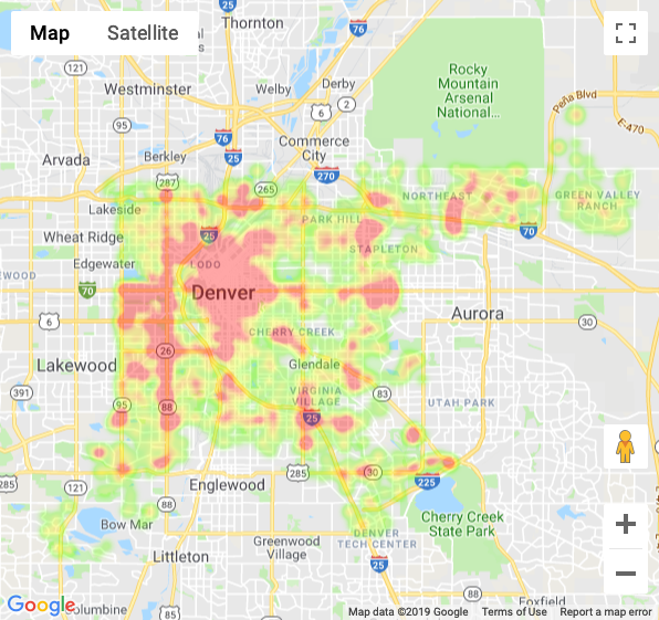
py.iplot(data)Crime heatmap for the last 30 days
I scrubbed the data to exclude traffic tickets so that I could visualize where the crime was happening. I selected 30 days from the last update to create a snapshot of crime in Denver.
The HTML version of this map loads very slowly, so I am providing a picture of the results with a link. Next on the to-do-list is to host all of this data processing on a live python site, which should be much faster and more interactive.
JupyterLab Notebook
All of the code work was done using Jupyter Labs notebook. You can find the file on my